At the 2016 edition of Art Dubai Modern, Samia Halaby will be featured in The Mechanics of Nature, an exhibition organized by Ayyam Gallery that explores historical developments in abstract art through the works of two pioneering Arab painters.
Halaby is represented in the exhibition with examples that date from the 1960s to the 1980s, a formative stage of her development, when she arrived at the formal and conceptual bases of her celebrated aesthetic. This period of her oeuvre materialized while she was teaching at American universities. Halaby began her academic career at the University of Hawaii, Honolulu after studying at art schools in the Midwest. In 1971 she was recruited by Yale University to implement a groundbreaking studio art program that she first established at the Kansas City Art Institute. Halaby taught at the Yale School of Art until 1982, and was the first full-time female associate professor in the department’s history.
In the interview below, Halaby discusses the many experiments behind this range of work, and how certain artistic influences allowed her to deconstruct the basic principles of figurative painting, leading to a materialist approach to abstraction.
Maymanah Farhat (MF): The early works that are on view in Art Dubai Modern date back to the 1960s, shortly after you graduated from Indiana University, Bloomington with an MFA in painting. These colorful abstract expressionist works are quite different from the geometric still lifes that you produced at the end of the decade, yet can be read as an indication of where your painting style was headed and the lessons and experiments you had been exploring for some time.
Can you walk us through your training as a painter, which took place at three different institutions in the American Midwest and ranged from scientific design to studio art? How did this interdisciplinary approach shape your early understanding of painting? For example, you have previously mentioned that you studied with faculty members at the University of Cincinnati who came from a Bauhaus frame of mind, while at Indiana University the 1963 release of Josef Albers’ Interaction of Color made quite an impact on you and your fellow students.
Samia Halaby (SH): My education in the Midwest was truly unusual. It was as though before me was placed an array of distinguished teaching methods and artistic movements. One expects these to come from internationally famous art schools such as the Yale School of Art at which I taught for a period of ten years, 1971 - 1982. But instead it came from the more materialist grass roots of the Midwest of America during the 1950s and 60s. As I look back, I see not only the Bauhaus with its ancestry in the Soviet Revolution, but also the French Academy, New York Abstract Expressionism, the California school of painting, and, most amazingly, leftist aesthetic thought hanging around in 1955 in Cincinnati, stemming from artists of the Great Depression, of the 1930s and 1940s.
Each one left a strong mark on me. I felt that by luck of time and place, I received an unplanned education of the best kind. It being unplanned left me the freedom as a polite Palestinian youth to watch it all, quietly selecting what to disregard or absorb. I took it all in. The Bauhaus influence was strong in my first years of study at the University of Cincinnati. There was a special course on materials and the need to learn how to manipulate a lot of them and to understand the theoretic importance of using them according to their nature. We were taught that beauty results from function or as they were wont to say, “form follows function.”
A particular course on color at the University of Cincinnati had an immense influence on my painting throughout my life. It was taught by two professors, an artist and a physicist. The artist was descended from the 1940 school of American leftism. The art teacher taught us the Munsell system and various principles of color harmony; while the physicist taught us the science of light and color and the physiology of the eye. He had flare and loved to perform. He prepared for our small class of approximately fifteen students a series of experiments, which wowed and awed us. We went to him each class at the physics building to attend something that was to me more exciting than spectacular entertainment. I remember the machine that measured and graphed a wave length distribution curve for any surface we placed in it; I remember the sunset he recreated on the physics lab table to explain why the sun is red at the horizon; I remember the sodium arc light in the darkened classroom that turned my classmates’ faces colorless — like being live inside a black and white film; I remember him explaining why we only saw black to white when a light source emitted only one wavelength — yellow in the case of the sodium arc. Our textbook was a work of science. I read and referred to it many times throughout my early career as a painter. It was the most honored book in my library, and is titled An Introduction to Color by Ralph Evans. (New York: John Wiley & Sons, Inc., 1948).
The French Academy came to me at the University of Cincinnati through the courses in drawing and painting presented to us by a graduate of that academy. We learnt to crosshatch and worked from plaster cast for one year before we were allowed a live model. I remember erasing the charcoal by beating the paper with a little piece of chamois and blowing my heart out to apply fixative through a bent metal pipe. We were exposed to the aesthetics of the American leftist painters, the social realists like Ben Shahn, Stuart Davis, William Gropper, Philip Evergood, and Jacob Lawrence, through several teachers, as these were the artists they admired in their own youth. I remember an art history teacher during my first two years at the University of Cincinnati. His salty attitude and aesthetic pronouncement were all gladly absorbed, but years later when American life became more familiar to me I began to appreciate the significance of his intellectual freedom.
The American Abstract Expressionist movement came to me through visiting professors during one year as a graduate student at Michigan State University in East Lansing in 1959--1960. They came as luminaries pronouncing their ideas. Criticism was often laced with insinuations of phallic symbols hidden in the painting, which were intended to embarrass the students. They were men with macho attitudes, and I did not like their teaching but admired Abstract Expressionist painting. The California school came through the influences of James McGarrell while I was a graduate student at Indiana University. I admired and respected McGarrell but the way he painted was not for me. By then, 1962/63, I knew that I wanted abstraction. Art historians at Indiana University were great lecturers and I adored their classes and spent hours in the library pouring over their extensive reading list. Of course, I did not read everything but I looked at every reproduction. I consciously enjoyed those lectures knowing that the pleasure of them would end when I graduated. One of the books that made a splash at the time and was recommended by all our professors was Josef Albers’ The Interaction of Color. It was a big, heavy, expensive book and I would not have been able to buy it. Reading it in the library was a privilege, and I absorbed its messages with ease, having had the grounding provided by my color course at the University of Cincinnati.
So this was my education, good but decidedly Western-centric. I had to learn the importance and meaning of Asian and Arabic art on my own.
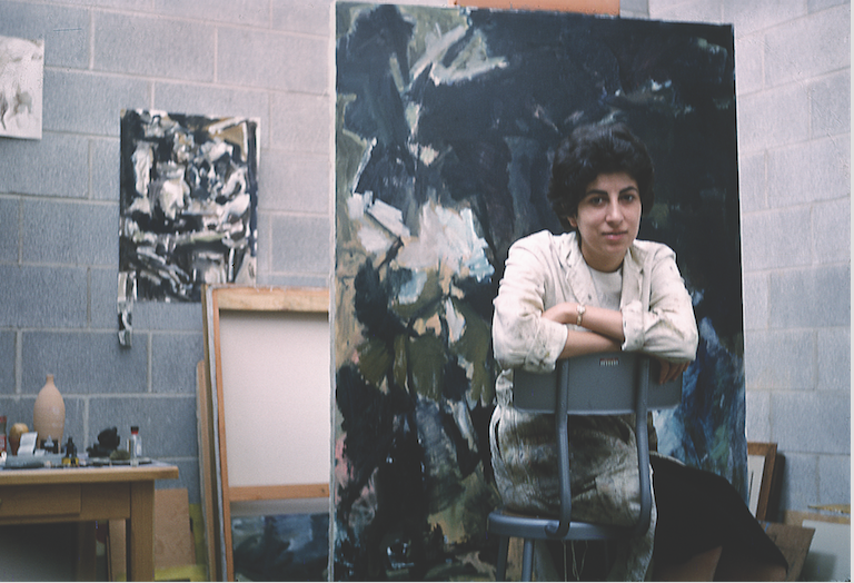 [Samia Halaby in her studio at Indiana University, 1961. Image courtesy of the artist.]
MF: On the one hand, Abstract Expressionism was positioned as the antithesis to the politically-minded work that came just before it, the leftist strand of the 1930s and 1940s that stretched from California to New York and included artists such as Stuart Davis, who advocated a type of abstraction that reflected modern industry as read through a Marxist lens. The ideas that you describe, the macho, formalist tendencies of the movement that were devoid of references to reality were very much tied to the brand of criticism that sprang up around the New York artists, despite the fact that painters like Jackson Pollock came from leftist backgrounds that positioned art as a means of social change.
SH: I see the Abstract Expressionists as growing out of the leftists of the 1930s and 1940s not as their antithesis as some critics of the time liked to say. The cubist forms of the American leftists were descended from the revolutionary movements of Cubism, Futurism, and Constructivism — movements that grew in the intellectual atmosphere of working class revolution. One of the constructivists, Alexander Rodchenko, created drawings during the thirties that foretell the work of Jackson Pollock. Other hints of painterly abstraction developed under the influence of the Soviet revolution. I think of the amazing student painting of Maria Ender, a reproduction of which hangs in my studio. With this in mind one can see how the painterliness of the Abstract Expressionists grew naturally from previous American painters. Moreover, many of them were leftists in persuasion and were terrorized by the intelligence services during the McCarthy period.
MF: Your early works deviate from the school in that they are based on solid color fields and the interactions of different hues. When admiring Abstract Expressionism, what appealed to you most?
SH: Hints of Abstract Expressionist painting were arriving in the Midwest. The idea of abstraction excited me. A crisp memory from 1957, my second year as an undergraduate student, was when I allowed myself to dare to paint a little abstraction. I greatly admired the Abstract Expressionists for the fact that they stood against conservative taste. Some claimed their work to be no more than the scratching of a monkey. I saw something in those infamous paintings and felt that those who hated abstraction had little concept of its potential.
My paintings during my early graduate student years 1959 to 1962 were influenced by Abstract Expressionism. By 1963 I had developed a language closer to the Minimalists. By the time I was a graduate student at Indiana University, the paintings of Mark Rothko and Ad Reinhardt were known and I learnt a lot from them. I admired Rothko far more than Reinhardt; and of course, I knew of Josef Albers. The space of my painting and choice of color differs from all three but the idea of fields of color adjacent to each other is the same.
Forgetting my early student paintings, the period of the sixties in my work is divided into two. The first is the color field paintings that I did in the first half of the 1960s, while during the second half I had made a substantial change and started on a path that took me to the geometric still life paintings. The first period was the last paintings of my student life and the first years after graduation.
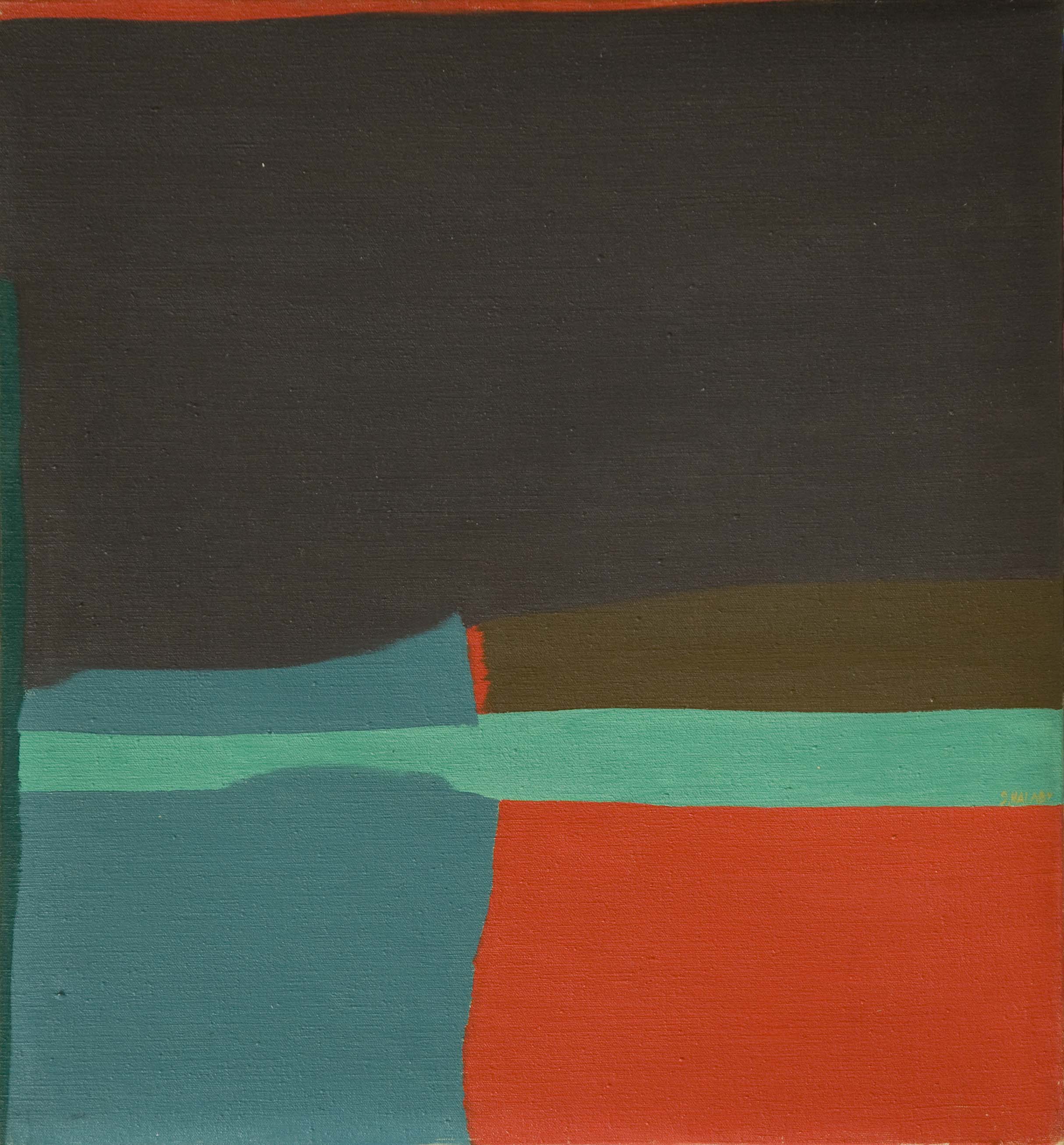 [Samia Halaby, Beer Knife (1964). Image copyright and courtesy of the artist.]
.jpg) [Samia Halaby, Red Line (1966). Image copyright and courtesy of the artist.]
[Samia Halaby, Red Line (1966). Image copyright and courtesy of the artist.]
MF: What do the color fields signify or allude to in your early works? Are the references to reality, or more specifically things found in nature, or are they early experiments in color relation? At that point in your development was there a difference?
SH: What a challenging question. I think that Albers and Reinhardt were very interested in precise exploration, limiting variables to discover specific results, while Rothko was more painterly—reacting more to the world around him. In Rothko I saw architecture, doorways, windows, paths, space, light, not specifics of them but the general principles of them. I kept thinking about the illusion of space that color fields make in a painting and how relative luminosity and saturation are based on how we see the world around us. A brown or even a white building is low in saturation and much darker than the sky; therefore a brown or dull gray field against a bright blue one will create that same space we know in reality of a building against the sky. To some extent this guided how I selected colors. I was thinking also of the interaction of surfaces, the relationship of borders and movement. One title of a painting at that time betrays my focus: Board, Cord, and Runner. But most of the titles of those paintings reflected my youthful zeal. At the time, our historians at Indiana University were expounding on Surrealism and though I was always critical of that movement, I was fascinated by the possible results of unexpected word combinations like Beer Knife (1964) or Earth Bandage (1963). In truth those titles have nothing to do with the content of the painting.
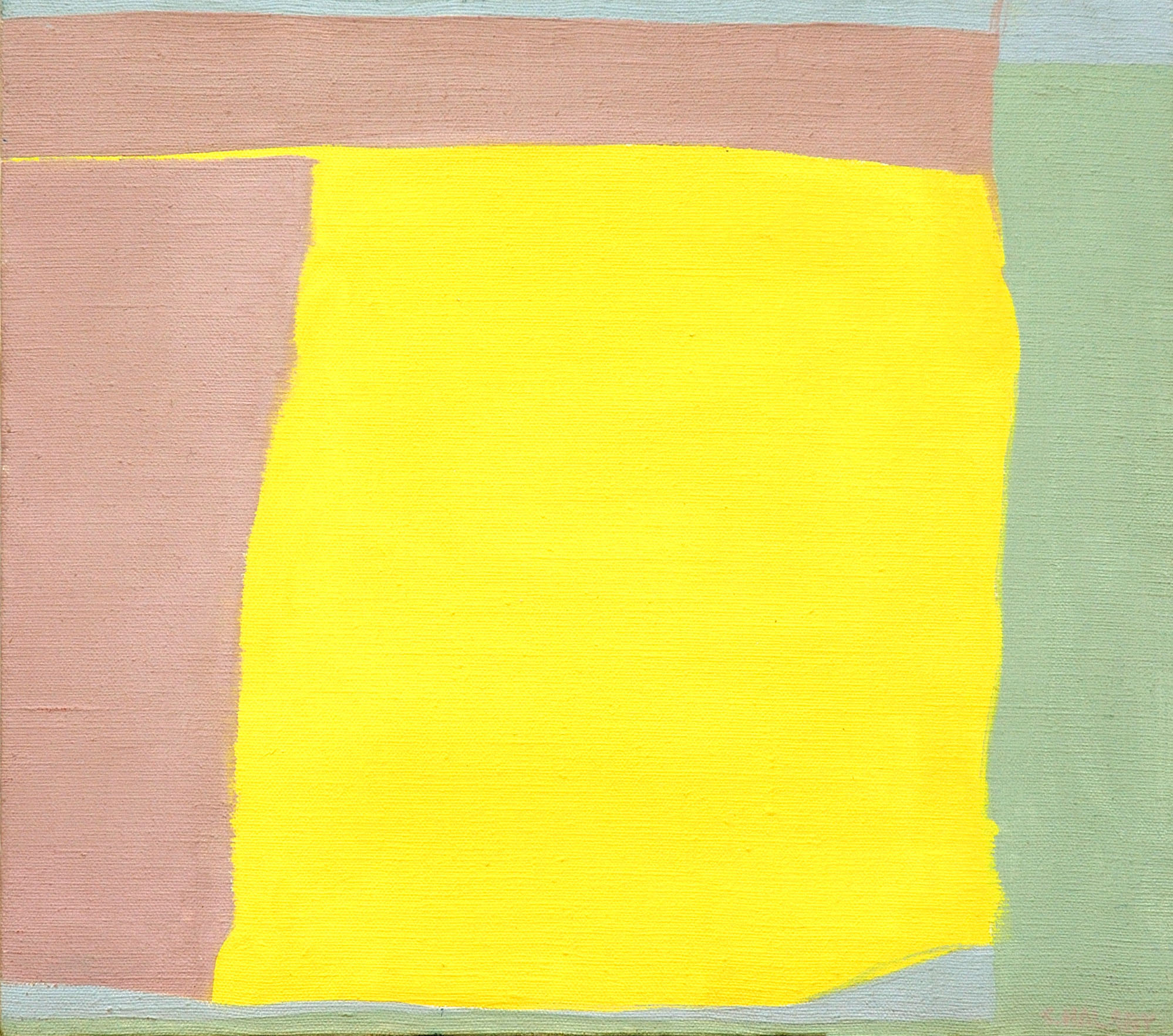 [Samia Halaby, Yellow Square (1963). Image copyright and courtesy of the artist.]
MF: Can your mid 1960s paintings be understood through a materialist reading of culture and sociotechnological development, or did that come later with your entrance into leftist activism? Were these works experiments in pure form, or did they signal the beginning of your decades-long treatise on art?
SH: During the second half of the 1960s I started on a path that I thought of as my own and which emanated from a combination of my education and my growing awareness of the history of Arab art and of painting worldwide. It really was very simple, as I was very focused then. My attitude was to limit myself to essentials. I was teaching, and thinking a lot about what I paint and why. I felt that I must discover a path of my own and not rely on my education. I remember the thousand dead ends and the frustration. To save my sanity, I attended every session of figure drawing taught at the Kansas City Art Institute, where I was then teaching. So I did figure drawing for six months until I encountered Petrus Christus at the museum.
MF: With the discovery of Petrus Christus’ Virgin and Child in a Domestic Interior (1460-67) you formulated a type of abstract shading that would provide depth and volume without the illusionist techniques that are common in figurative painting, and then incorporated your observations from Arabic and Islamic geometric abstraction.
SH: Simultaneous with being excited by a painting of Petrus Christus, I had come to the conclusion that the answer to my quest lies in seeing since painting is visual. So I began to ask how exactly do our eyes see and how does our brain interpret it with its lifetime of experience. And if we understand what we see, what do we select to see and put on a canvas. This took me immediately to a very analytical attitude. I remember one student while I was teaching at the University of Michigan writing a paper on my work and labeling it mathematical realism. My own, most startling discovery on asking myself what exactly our eyes see was when I held an empty and stained paper cup in my hand and decided that I should be able to see it as either convex or concave. I stared long enough at it until indeed it turned inside out and I saw it as convex, that is I saw the bottom of the inside of the cup was higher than the rim. As I stared at the oddity of it I was surprised to learn something about movement. I learnt that the movement of both our eyes and our body dominates how we see —a good lesson.
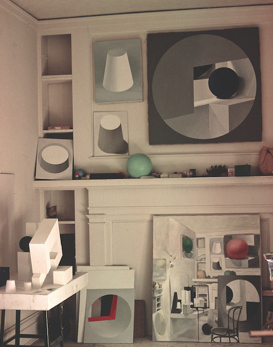 [Samia Halaby`s Kansas City studio, 1966]
.jpg) [Samia Halaby, Two Diagonals (1968). Image copyright and courtesy of the artist.]
[Samia Halaby, Two Diagonals (1968). Image copyright and courtesy of the artist.]
MF: The works that followed are also based on these initial findings, but how and when did you transition to focusing on the physical properties of specific materials such as copper or the way light hits three-dimensional objects like a cylinder? How did this relate to your understanding of abstraction?
SH: From my color class, I remembered learning that all materials reflect light from two surfaces, so to speak, and that the upper surface of most materials is non-selective in its reflectance and thus we see all highlights at white regardless of whether they bounce back from skin, a green leaf, or a red apple. However, metals have the special capacity to be selective in their reflectance on the upper surface. Thus gold fascinates us because its highlights are yellow. My fascination was with the surface qualities of metals and their ability, when imitated in a painting, to create a surface that is unstable, meaning it is a surface and possesses depth simultaneously.
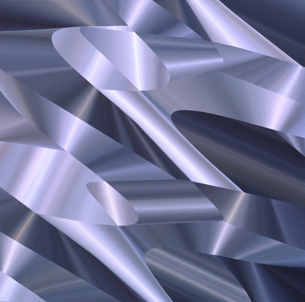 [Samia Halaby, Aluminium and Steel (1971). Collection of the Mead Art Museum, Amherst College.]
MF: In 1966 you traveled to the Arab world for the first time since you immigrated to the United States via Lebanon after your family was forcefully displaced from Palestine in 1948. What was the experience like as a young artist? As you studied some of the most monumental examples of Islamic architecture in Jerusalem, Damascus, and Cairo, did this fieldwork clarify your previous research of Arab aesthetics? Did you make new discoveries?
SH: I was young and earnest and believed that I must fulfill the goals of the little grant provided by the Kansas City Art Institute for faculty development to the fullest. Beside the three important cities you mention, I also visited Istanbul and all its mosques. It was a spectacular experience but it took approximately six years to manifest itself in my work. I visited mostly mosques but also the Topkapi Museum in Istanbul, strolling slowly and taking in as much as I could and photographing it all. It became amply clear that western historians had no idea about the formal aspect of Arabic geometric art. They focused on the symmetry and architectural structure. Symmetry was seen as patterns that filled space. How specific sections of these patterns were enclosed in specific fields and how they suggested the uses of architectural space was mostly overlooked. In the hands of Arab masters what seems like a plethora of detail transcends itself and becomes a glowing calm beauty that reaches deep into my sensations and moves me more than a visual narrative of a theme first conceived in words. There is something of color mixing similar to that of Impressionism in Islamic architecture. One formal attribute to assert itself in my work was the relationship of materials adjacent to each other in the many types of inlays in Arabic art. The outstanding, most memorable influence was that of the grand marble inlays on the outside walls of The Dome of The Rock.
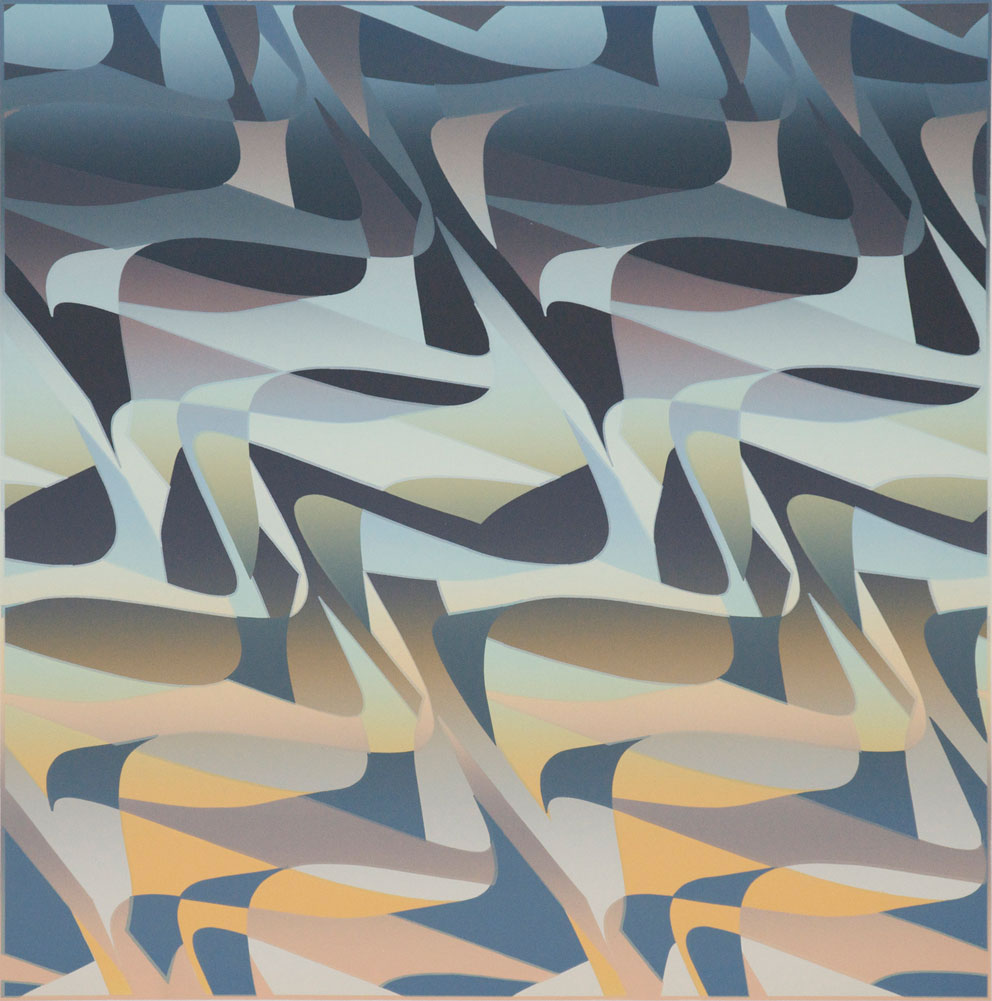 [Samia Halaby, Albuquerque Sunset (1972), (lithograph). Image copyright and courtesy of the artist.]
MF: The influence of historical examples of geometric abstraction can be found throughout your oeuvre. Among the works shown in Art Dubai Modern, we see it resurface in the 1980s Dome of the Rock series. At that point, however, you added texture and visible brushstrokes. What inspired you to break from the meticulous forms of painting that can be found in your 1970s works?
SH: The Dome of the Rock series is based on that monument, an architectural wonder. Not only was I impressed by the geometry, and felt very close to it, but also by the aesthetic forms used in selecting materials. The textures in those paintings remained limited to specific areas so that the specific geometric parts of the painting were like an inlay of textures. The geometric divisions of those paintings were also deeply influenced by The Dome. The way geometric patterns were selected to fit shapes such as rectangular, circular, or diamond panels was carefully planned. This is why in the Dome of the Rock series I extrapolated all shapes within the painting from the rectangle of the painting.
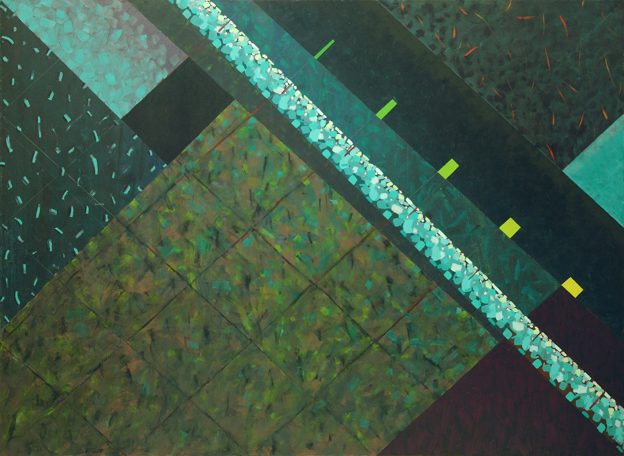 [Samia Halaby, Night Seeing (1980). Image copyright and courtesy of the artist.]
In the Dome of the Rock series, the painting Night Seeing (1980) is another example of my interest in how our eyes work. Its basis is how in low levels of light we are more sensitive to green, while in high levels of light, our eyes are more sensitive to orange. I therefore selected colors to create a world of green that might allude to what we might see in a forest late in the evening.
Then as time went by, I wanted to create a deeper space in front of the allusion to inlays in these paintings, as their space was shallow. This too came from Islamic architecture. It seemed to me that true appreciation of Islamic architecture included the ambience created by the visual mixture of color and shape, as though the very hollow space of buildings was itself not transparent but full of reflections of all that was on the wall, ceiling, floors, stained glass, and columns. I also simply wanted to make free arm movements, to break the taboo of crossing boundaries, to allow shapes and areas to share attributes, and all this kept growing, leading to more ideas. So that is how it is. I do not paint subject matter; I do not start with words or themes. I start with my eyes. I paint the beautiful things we all see with our eyes. Some people tell me they see a world that is drab and colorless. Clearly, then, we tell our eyes how and what to see.
Editor`s Notes: The Mechanics of Nature will be on view at Art Dubai Modern from 16-19 March, and includes 1980s works by the late Moustafa Fathi.
The above post is part of a series of interviews by the author that explores Samia Halaby`s life as an artist and scholar. The first of the series covers her research and writings on Palestinian art. The next installment will discuss her experiences as a New York-based artist for more than fifty years.